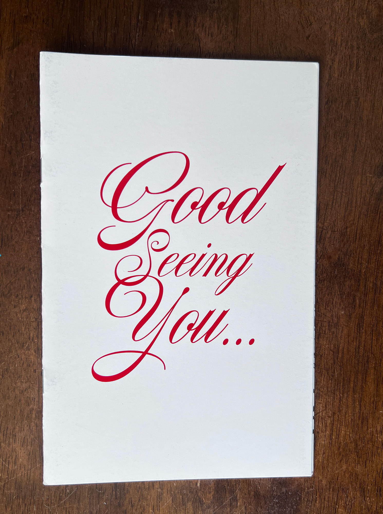
08 | Good Seeing You (2021)
A zine spotlight from the archive

Before I get into the main part of this newsletter, I want to go over a few format changes. You may have noticed that the newsletter has a new name. I decided to change from “Nontxt” to “Nonstndrd+Process” to make the connection to my creative practice more obvious. The subject matter and goal are the same: to go deep on the artwork I create and the publications that I design under Nonstndrd Creative.
I also wanted to share the new logo I created for Nonstndrd Creative. I’ve been toying around incorporating a bubble letter style “N” into the logotype as a nod to my graffiti roots. Using that premise as a starting point, I ended up with both this abstract icon.
Expect to start seeing the new branding on the redesigned website and new printed publications starting in 2025.

Now on to the main subject of this installment of Nonstndrd Process, my 2021 zine titled “Good Seeing You”.

I can remember when I decided to create this particular zine very clearly. In 2021 the pandemic lockdowns were still in full force and honestly, I missed seeing people. Not only people who I knew and loved but also just random strangers that I saw during my daily routine. My job at the time had switched to being 100% remote so I didn’t have the chance to really interact with anyone beyond my immediate family. It’s true that sometimes you don’t appreciate what you have until it’s gone. I honestly couldn’t really imagine a world in which I didn’t get to be outside in public on a regular basis. That was the context that inspired me to create this zine.


"Good Seeing You", 2021.
I started drawing all the types of people I remember seeing on the days I took public transit to work. Once I began working on the zine, the ideas just began flowing. In a lot of ways it was therapeutic for me draw these imaginary residents. It really helped me through what I have come to realize was a pretty tough time.
The finished zine utilized a very basic layout that I had used in the past, 14 original drawings and a center spread that was a combination of all of them. In total it had 16 interior pages that were BW, saddle stitched with a color gloss cover. I went with a script font on the cover because the whole design/publishing process reminded me of writing a letter, only instead of the recipient being a person it was a city that I sorely missed.
Thanks for taking this trip behind the scenes with me on the creation of “Good Seeing You.” I’ll be back soon with more notes on self publishing and the creative process behind my work as Nonstndrd.

