03 | Powered By Self
I make things.
It’s important to take your personal projects seriously. This is something that I realized early in life and learned to always trust my gut. Almost every major accomplishment in my career is the result of following through on an idea with the same energy that I would apply to client work or my day job. My skillset as a designer is an important tool to me as an artist. From branding to the online presentation (down to CSS, coding, and theme design) and print prepress, it’s all a part of the same creative vision.
My main personal project at the moment is Archival Recordings. Some of you may know me as a photographer first. I’ve had some success in recent years as a documentary landscape photographer and my Archival Recordings newsletter/zine is the latest manifestation of that aspect of my practice.
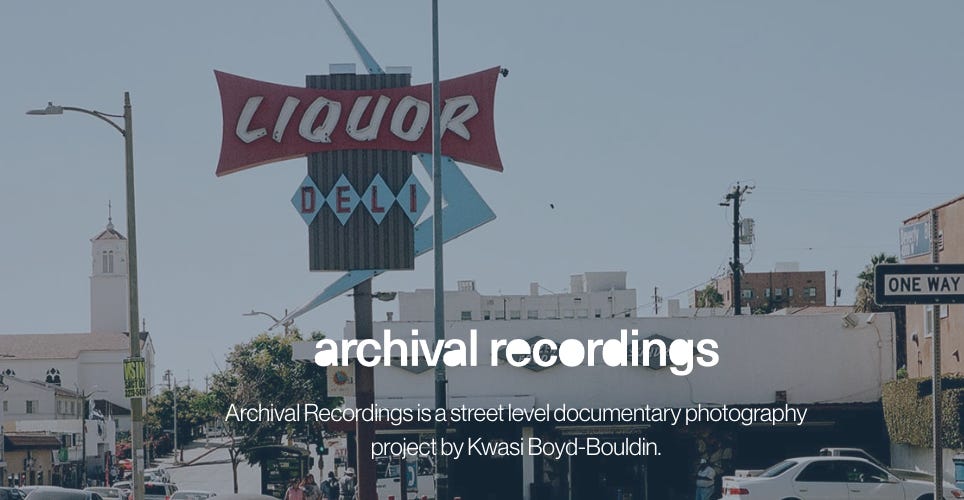
When I decide to start a project, one of the first things that I start working on after I decide what I’m going to call it is the logotype. Most of my photography projects over the years have had narrative themes to provide context to the work I produce. I started off in 2015 with the Los Angeles Recordings and had a few others like The Public Work, and now, Archival Recordings. In each case, I designed branding elements built around the core theme and each iteration was an improvement on the one prior. The gaps in between projects were a result of their success, they all led to paid work and new professional opportunities.
Using everything that I have learned from my past endeavors, I decided that the goal for Archival Recordings would be fundamentally different. I’m not using it as a way to get new projects as much as it IS the main project, a distinction that has guided my approach to every aspect of it’s execution. From the platform I chose to build the online element on (Ghost) to the printed zines and their covers (which are the focus of today’s newsletter), the version that exists today is the result of a singular creative focus.
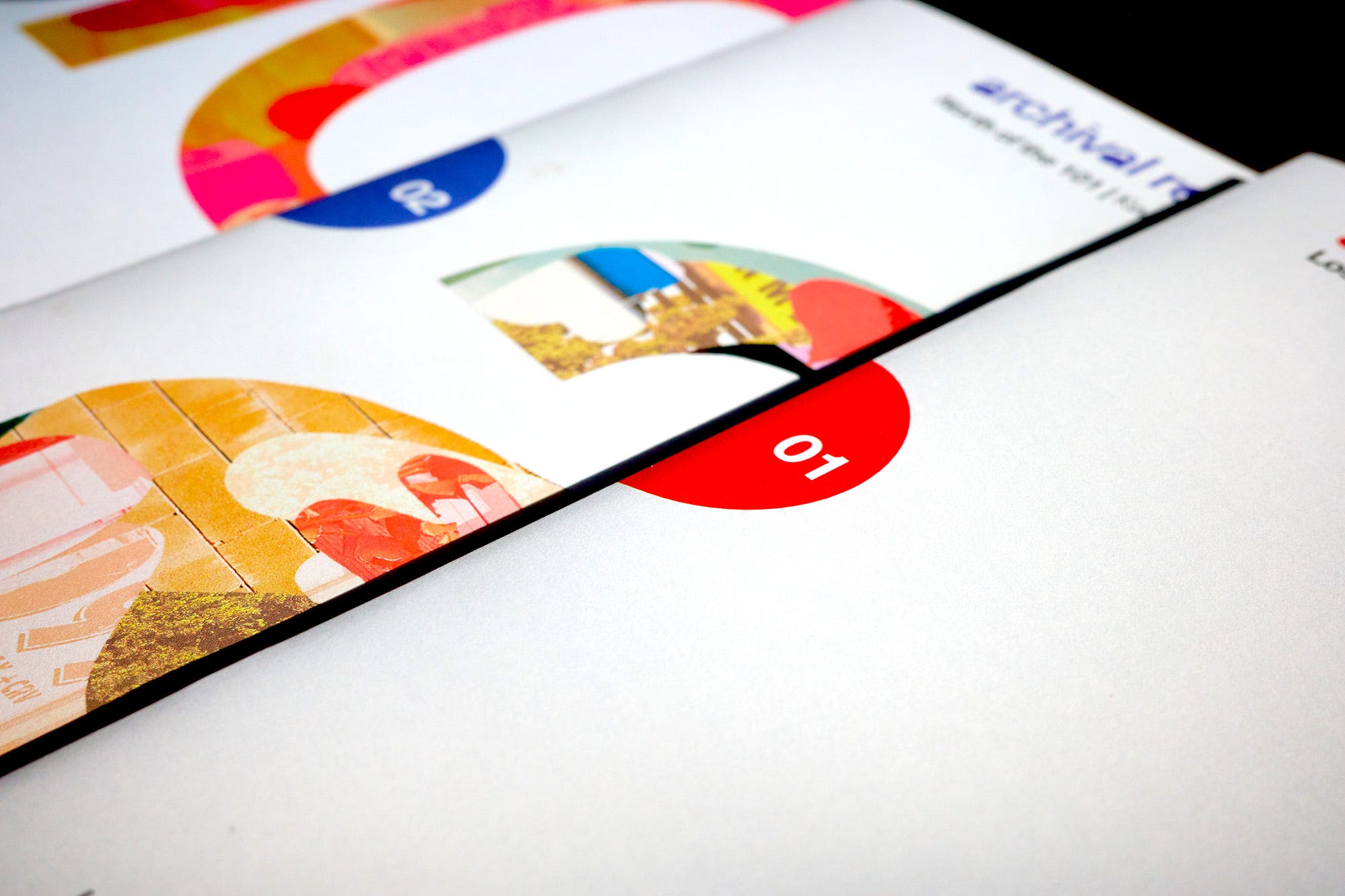
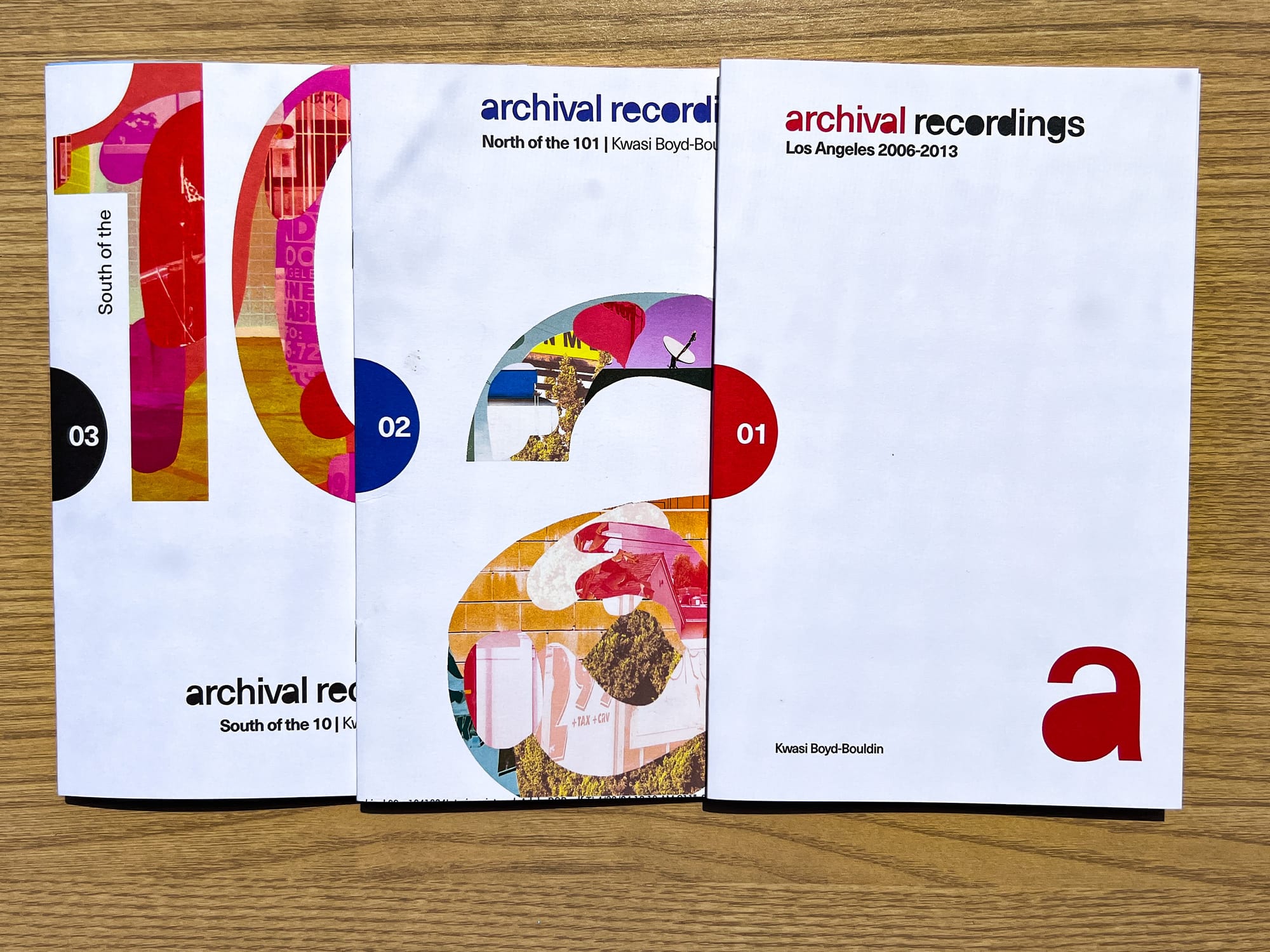
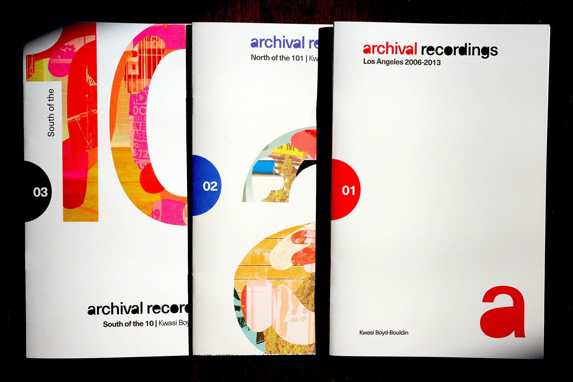
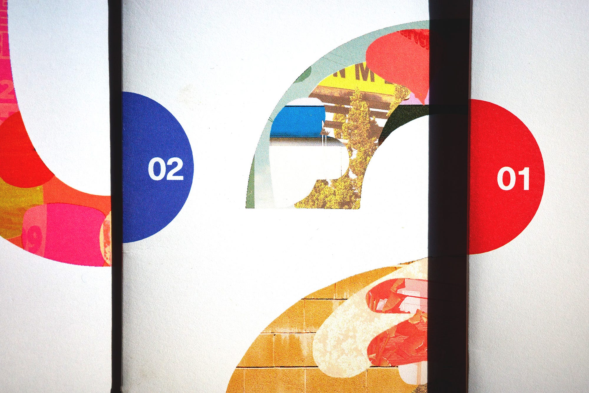
The printed zines I produce under Archival Recordings are the most important aspect of the initiative. I want each publication to both stand on it’s own as a snapshot of Los Angeles and to work as a part of a set. To this end, I created a set of graphic elements to serve as constants for each cover. The first is the logotype but one of my favorite things about the cover design is the half circle that is positioned in the center of the spine. It’s placement is strategic and, combined with the color, serves as a quick way to identify each zine volume on a bookshelf. It also sets the tone for the circular compositions each cover design is based on.
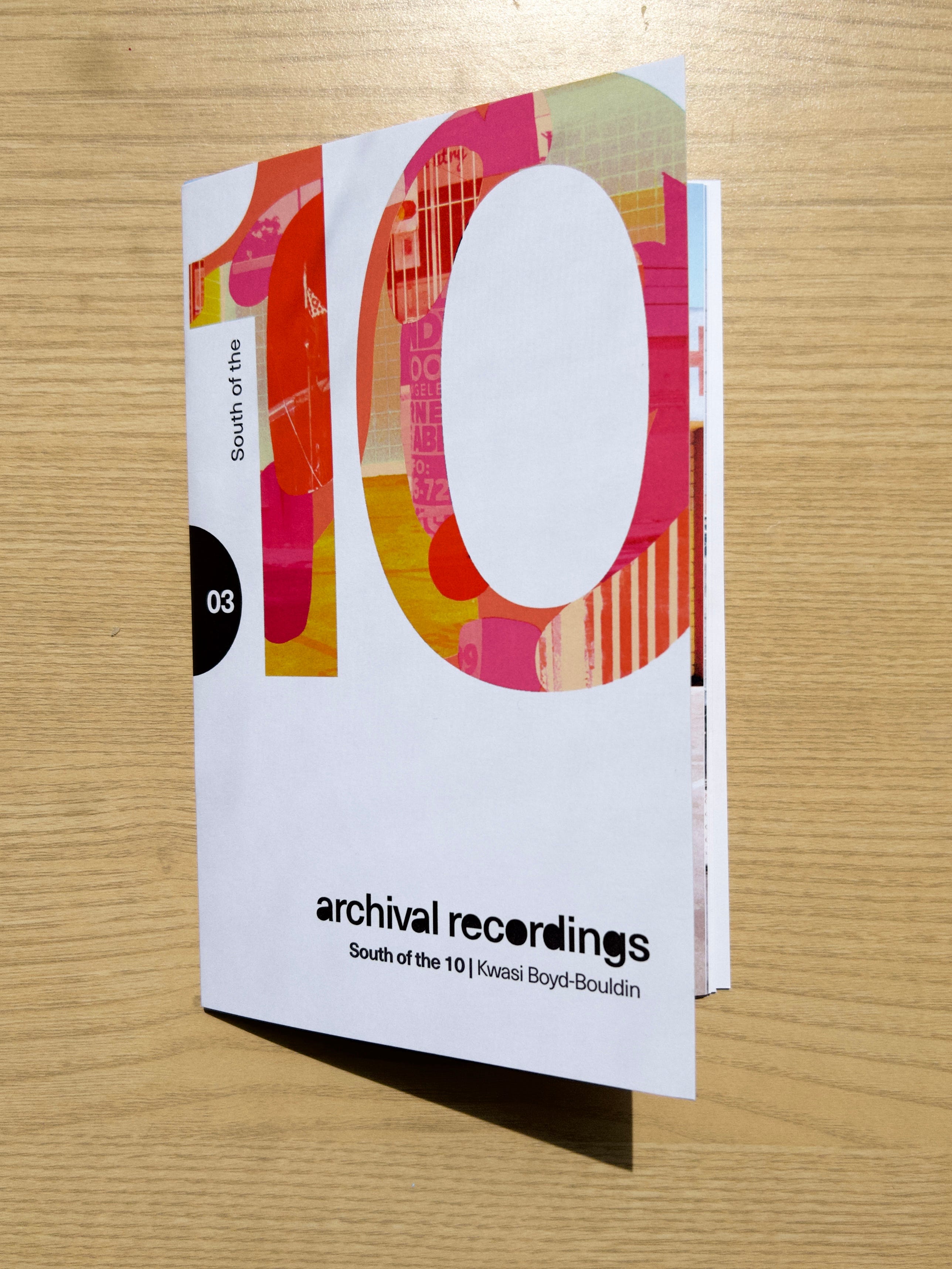
When placed together the covers become compositions onto themselves, further emphasizing the unified design language and strengthening the minimalist aesthetic of the project.
Thanks for reading! I have found that the more I pour into designing every aspect of my creative projects, the more successful they eventually are. Even the mundane elements contribute in sometimes unseen ways to the way a project is received. That alone can be the difference that sets your work apart from your peers.
Until next time!
